You have to work with the relative potion for the container.
The left and right column have to stay the same but the container has to change
Centrally aligning the design
left 50%
right 50%
Margin left -512px
Creating the other pages
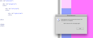
We need to change the INDEX page into a TEMPLATE and create a DWT
You create the dream weaver page first then you clone all the information onto other pages.
You create a template then you clone everything on that template. So if you then later on want to add another page you just have to add one on, you dont have to make universal changes, just to add on.
Template works - you define areas that are going to be editable / that you can change - this is called an 'editable region.
This is where it is going to change and where the editable region will be.
save as 'template' not index
There will now be a second subfolder
Once this is made you can go back to the root folder and delete the index page...but we are going to recreate it in seconds
Then go file new and...
Then to create 5 pages you need to just go file - new template then save each as an html in the root folder.
IMAGES - the key thing about them is the way you display them...
ROLLOVER BUTTONS - design in photoshop
You need to make images etc as small as possible otherwise it will take too long to load.
If the background to the image is going to be a solid colour (white) - there is no point giving the solid colour in photoshop otherwise it would be significantly larger, so you need a transparent colour / background. You can add the area of the layout the colour in dreamweaver.
JPEG is the best format to use for images because it allows you to use / change it...
The only problem is that JPEG doesn't support transparency
For animation you use GIFF
You make all the changes to the template page and it will apply these to all the different pages.
Creating a rollover button - it is only possible to use Java script
Buttons will go inside the navigation bar
"alternate text' - this is the yellow box that appears when you hover over a button - this is also what is searchable by google so it is IMPORTANT to include. By law any user has to be able to use the website, (blind people) they will have a screenreader, so for this you have alternate text and the computer will read it out, so they can navigate around.
Make sure that each button line of code is seperated so you dont get confused, so just move the div down.
Then go into the design of each page and rename the left column
IMAGES
When you add padding to the columns, it will automaticall make the whole design bigger so you have to remember to minus what you added to the main section


No comments:
Post a Comment